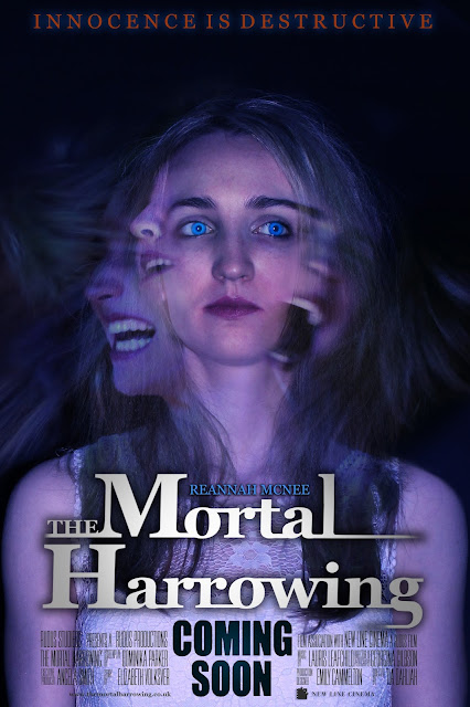
Final Product
Photoshop Process
Process from DomMalina
Previous Versions:
Originally, I wanted this image as my poster, closely following my sketch idea. Once I have finished with it, I've decided to redo it because it didn't seem to fit with the story, people assumed that it was more about drama rather than psychological thriller/ horror related. Therefore, I've kept the main image in the center and changed the surrounding faces to different photographs I used for a short trailer shot.
Right before finishing the poster, the tag line was in red because the colour red relates to danger, blood and passion which is quite fitting for the sentence. I've changed my mind at the last second and changed the font colour from red to blue to match completely with the whole poser making it look more professional overall as it fit's with the overall theme.


No comments:
Post a Comment