Thursday 6 April 2017

Question 4

'How did you use new media technologies in the construction and research, planning and evaluation stages?'

Research and Planning


Additionally, I've used "Haiku Deck" to present my Audience Demograph.

Construction


Evaluation

For displaying my Evaluation Questions, I used various tools such as Prezi, HaikuDeck, Slideshare (PowerPoint), screenshots and GIFS showcased directly onto blogger.  Blogger is extremely easy to use and is completely free giving me the freedom to edit the layout making it more visually appealing. It also allows me to 'embed' presentations, implement images and even videos from YouTube. I have used GIFS to show the process visually, making it easier to understand what I am trying to explain as an example from the trailer. The GIFS were produced by extracting some clips from the Vlogs and the trailer onto a free GIF making website.

Tuesday 28 March 2017

Question 3

'What have you learnt from your audience feedback?'


My Audience Demograph - Created with Haiku Deck, presentation software that inspires;


 SURVEY: https://www.surveymonkey.co.uk/r/3CZS828


Audience feedback is essential for a successful product. It is important because it allows me to find out whether the product was as I predicted or it was different. By gathering data, I can find out about my audience for this particular film and this information could be used for future similar products as target audience to predict the success of the future product. Not to mention, using the audience feedback gives the product more opportunities to improve and become more appealing to the fans. There are various methods to obtain audience feedback. These include:
  •  'One on One' Interviews: collecting a large amount of data using interviews costs more money and time, however the feedback is more detailed resulting in a more open ended response. 
  • Comments: As we live in the modern age of the Internet, trailers can obtain a lot of feedback from the comment section on popular video platforms such as 'YouTube' and 'Facebook'. Not to mention, using a video platform can reach a lot of audience increasing the profit of the product as the clips can generate millions of views. Additionally, uploading a clip on youtube advertises the product and the producer could receive additional money for adds placed before the video from the social network.
  • Questionnaires: Internet surveys are a popular tool to evaluate a product. Many organizations obtain a large about of audience feedback. The reason why internet questionnaires are popular is because the data is automatically shown after a person fills out the questionnaire. Moreover, producing an internet questionnaire is easy to make, cheap and/or free resulting in no money or time wasted. Online tests, for example, are useful because the audience are anonymous which means they are more likely give an honest answer.
  • Test Screenings: The majority of produced film products 'test screen' before making their film available for the majority of the public. This means that a preview of the film is shown to a selection of people to record their reactions and feedback. The feedback is then analysed and edited according to the suggestions/complaints. However, test screenings sample a small amount of audience meaning that more than one platform of feedback is needed to obtain accurate results. 
  • Questions & Answers: These usually apply in film conventions and film festivals, a place where people with the same interest of films gather. The viewers could ask questions and obtain answers from the producers in these particular places.

I created an online questionnaire made up from 10 distinct questions in order to gather information for my trailer using a well known website called the 'SurveyMonkey'. The reason being is because it is free easy to spread around through social media, gather a larger amount of people and gathers information through graphs instantaneously. The answers are more likely going to turn out honest because the questionnaire reserves the anonymity of the person answering the questions. I will be sampling at least 10 people for my questionnaire. 


Results


Question 1: The majority of my audience is aged from 18 to 24 years old. This means that my prediction was not wrong as I thought that the majority of my audience will be young adults. Additionally, it turns out that some of my audience are older, there are more 45 to 54 year old audience than there are 25 to 34. This means that the psychological genre appeals also to an older audience which confirms the results from the target audience of films such as Jacob's Ladder on the 'YouGov' website. This suggests that the plot is clearly psychological and can be appealing to a more mature audience. What is interesting, is that all of my mature audience are male, whilst most audience that are in the 18 to 24 years category are female, this might be because the main character is also a young female, which might be relatable to other women of that age group influencing them to watch the film/ trailer. 

 Question 2: As I thought, my audience turned out equally male and female. This suggests that my advertising appealed to both genders. This is a good thing because I can gain more audience by appealing to a larger group of people instead of limiting myself to a specific gender. 


Question 3: 70% of people liked the soundtrack the most, which makes sense as it took up most of my time and effort, it also fitted nicely with the visuals (such as the piano scene). The second most liked things about the trailer is the plot and the visuals meaning that my cinematography and narrative work was not bad. After that, people liked the character and the genre. The 'other' option had a response of: "Love the 1960's feel at the start "hammer house" effect." 


Question 4: Thankfully, most people didn't think there was anything unlikable about the trailer, the other respondents that stated "yes" said "When the main character says "the voices", I think it cuts off slightly too soon." I agree with this statement, that scene caused me some difficulties because of the camera errors as it kept turning off before I wanted to finish the scene. Another person says that "Basic story line was not understandable"  I could've made some things more obvious in my trailer if I had thought of the audience more. 

Question 5: However, most people did understand the plot perfectly or understood most things. I did not want to give away everything in terms of story in my trailer as it wouldn't make the film desirable to watch. To improve the understanding of the plot, I could've included more dialogue, maybe scattered throughout the trailer, since I did not include a scene with the 'therapist' as I intended in the beginning as that would mean obtaining another cast member and planning another shoot which would be time consuming whilst trying to meet the deadline.

Question 6: Luckily, most people thought that the monster was scary, and no one said that the monster wasn't scary, this means that the prop was used successfully making the trailer more interesting. This also suggests that the quality of the mask was quite good as it appears realistic, as if it is a real person with his face peeled off.

Question 7: My poster appears to be successful as most people agree that they would be more influenced to watch the trailer if they saw the "Mortal Harrowing" poster in a public area. This suggest that the poster itself tells some of the story making it more intriguing. 
Question 8: Just as my poster, the magazine turned out to be successful as well.  Out of 10 people questioned, 0% answered "No".  This means that most people will consider reading a story about "The Mortal Harrowing" if they saw it on a front cover of a film magazine.


Question 9: 8 out of 10 people thought that the magazine cover and the film poster looked similar. This confirms that my products appear to be done for the same marketing campaign - which is the trailer. When I questioned what they liked about both of these products (magazine and poster) people replied with different opinions. The most common thing that was liked about these products was the "Colour Scheme" as stated, it was "Consistent".  The most positive comment was "They have good synergy, especially in terms of colour scheme, so you can tell they're from the same campaign. The main across' glare into the camera grabs the readers attention"This comment was exactly what I wanted my product to show, the technical skills that helped me produce a colour palette and other synergy. Another positive comment states "The main images were consistent (same face for the campaign) and the actress looks attractive, haunting and intriguing. I also like the professional layout and smooth graphics. The tagline and articles are intriguing" which further indicates that my technical skills in Photoshop produced a successful outcome.  However, there is a comment that isn't so positive stating "Didn't like the second, too processed. The first would be easy to use on both advertising, DVD/BRD cover and book covers"  this means that I could make the actress appear more natural (without the bright eye glow) to avoid a 'too processed' look. 

Facebook:


I've also obtained some feedback from Facebook by sending the link of "The Mortal Harrowing" trailer that is located in YouTube to private messages. The feedback was positive and got shared throughout friends and family. 

Thursday 9 March 2017

Evaluation Question 2

'How effective is the combination of your main product, the trailer and your magazine cover?


Additional Props and Outfits:

Since wearing a dress wasn't always possible, due to cold conditions and difficulties with time, I made sure that if the cast isn't wearing a dress, she is wearing something dark or something 'depressing' as seen in the outfits below;

 Outfit 1

The coat was worn over the dress because the conditions were too cold and we were located in that area for a while, due to health and safety, the coat would need to be on as it would also make more sense in the film. However, this coat does match with the character and the outfit because of its colour. holding onto the 'innocent stereotype'.
Outfit 2

 In this shot, the main character is wearing black clothes which connotes to danger, mystery and darkness. This outfit is matching with her true character which fits well with her 'crazy' dialogue with the 'friend'. I wanted the other character to dress casually, but keep the 'depressing' theme of the film, which is why she is wearing black and white.
Outfit 3

This outfit is interesting as it has patterns but it is still matching with the theme, limiting the colours mostly to black and white. Since she is located inside, this scene suggests that she came from somewhere, perhaps from a psychiatrist since she has a prescription that was thrown in the trash. This outfit is slightly rebellious - showing her fight between the voices and the people from the 'outside'.


Props

 Pills

This prop was used to suggest to the audience that she might not be mentally stable, this is a 'powerful' close up shot of the pills being held while the hands are shaking. I did not end up using the initial pills as I thought the other type would make more sense, these pills are for stress management.
 Rusty Knife

I wanted the trailer to have a knife, luckily the location had a rusty 'disgusting' knife laying on the ground which fitted perfectly to what I envisioned. The reason why I wanted the knife to be disgusting is because I want to portray this location as 'imaginary', the location speaks for the character's mental state. The blood dripping off the rusty knife made it look even more discomforting, which is exactly what I wanted.
 Blood

The blood (on the floor) was used as a transition effect from the knife when the blood drops, suggesting she has harmed someone or something.
 Abandoned Objects (Dishes)

Another tool to  portray this location as 'imaginary', speaking for the character's mental state. Giving a rusty, abandoned look.
 Face Peel Mask

The face peel mask was used as if she is peeling off her face giving attention to problems such as skin picking which links to appearance dysphoria and insecurity. The close up shot makes it feel more disturbing and discomforting.
 Black Wool

Since this is an 'imaginary' location, I wanted to make it slightly more obvious by placing black wool around the character so it appears the main character is following it.

Monster Mask

The monster mask is used as a 'Cliff Hanger' in order to make the audience want to watch the 'full film' and find out why it exists and what it is. It is only (fully) shown at the end of the trailer as a 'reveal' as I didn't want to overuse this prop, otherwise it would become boring.

Wednesday 1 March 2017

Evaluation Question 1

'In what ways do your media products use, develop or challenge forms and conventions of real media products?'


  •  TRAILER CONVENTIONS 
  • Psychological Thriller, Horror themed.
  • Advertising for trailer - magazine and poster. 
  • Costumes and Props - Monster, black rope, white dress.
  • Makeup - unhealthy makeup, symbolising mental health but from the outside.
  • Cinematography - Over the shoulder shots, close ups.
  • Editing, Fast cut scenes mood lighting.
  • Location, 'dangerous & Isolated' places abandoned building and forest.
  • The main character is a Countertype, not innocent, not nice. 
  • Pills, shaky hands, face peel - Insanity and Anxiety.
  • Calm music, piano paying to give the character more 'personality' and set a particular mood which is deceiving the truth behind the character's true nature. 
  • Night Sky and old TV Effects.
  • The font is joined, matching the theme as the title has a word "Mortal" I've made the text look as if it does not end by joining each word together.
  • Tackles the issues of loneliness and distrust as the main character states that her friend doesn't care about her, the main character is also mostly alone symbolising solitude.
  • Makes audience question what is real and what isn't (Fight Club, Jacob's Ladder). The way the main character acts is questionable, the surroundings the character is located at is also strange to go to in a plain white dress alone. 
  • Twitch and overlapping effects, distort reality. These types of shots suggest that the things that take place may or may not be real. The twitches, blood and knife props and a terryfying monster symbolise a fight against oneself.
  • Narration - has a slight delay effect to the voice: distorts reality. The narrator is the main character talking to herself about herself. She states "Why am I still here? Just to suffer? I can feel every atom of my body. The body I've lost, the people I've lost - it won't stop hurting." This sentence makes the audience sympathise with the 'protagonist' in one level or another, yet feel completely alienated from her. 
  • Calm piano music: synchronised with piano shot and the trailer. Gives audience impression that throughout the first part of the trailer, the main character is playing the piano.
  • Piano notes - the melody gives the audience a disturbed and uneasy feeling. 
  • The title is shown at the end. This gives the trailer more suspense keeping the audience interested in the name of the film. 
  • The best parts of the 'film' are shown to attract the viewers (scary monster, blood and insanity.) 
  • Actor's emotions of fear, disconnection and anger - addition to the story of the character. These intense emotions give er more personality.
  • The trailer doesn't show the whole plot, making the audience question the story. Thus, getting intrigued.
  • Associated with companies: New Line Cinema and Warner Bro's Studio. I wanted to feature New Line Cinema on it's own initially, but after more research I found out that New Line Cinema films are distributed by Warner Bro's. Which is why I included both of them. I wanted to include a smaller distributing company but changed my mind into something more recognised. New Line Cinema seems like a better option for my type of genre. 
  • COUNTERTYPE
  • The trailer mostly focuses on one character creating a sense of loneliness showing things in the trailer that aren't supposedly real from the point of view of the main character. The film title "Mortal Harrowing" defines internal sadness, giving the audience ideas about the plot. 
  • The 'villain' is the main character. The main character is also not a villain, the protagonist is fighting against herself. 
  • The monster is not real, it is portrayed as a 'hallucination'. 
  • PLOT STEREOTYPES
  • Many Psychological films stereotype mental illnesses which wasn't my intent but in order to tell an interesting story, I had to follow some misconceptions about people with mental problems. To avoid much conflict, I restrained from revealing what type of mental illness the character has in any product's I've produced for my audience to avoid offending people who actually live with a particular type of mental illness.
  • Women stereotype - cannot control their emotions. This plot stereotype was also not in my intentions since I wanted a female character to portray other stereotypes such as innocence. 
  • POSTER CONVENTIONS
  • Main colour palette is blue, symbolising sadness.
  • The main image is of the main character.
  • The main character has various faces and different emotions (unpleasant) relating to the film title. The main face is emotionless.
  • The main character is wearing a white dress, symbolizing innocence and purity.
  • "Innocence is Destructive" Tagline. The sentence is an oxymoron. 
  • The title is not in capital letters similarly to "The Silence of The Lambs" film. Lowercase words sound quieter and calmer than uppercase words. 
  • The Tagline is all in capital letters, sounds harsh and aggressive.
  • Extremely blue eyes to match with the colour palette and capture audience's attention.
  • COUNTERTYPE (POSTER)
  • The poster is a portrait of the main character from different angles showing extreme emotion (mental illness portrayed through an image).
  • The protagonist fighting against herself is captured in that image.
  • The positive 'emotion' in the center of an image, shows her fighting against herself around her normal expression - out of focus and lowered opacity. 

  • MAGAZINE CONVENTIONS
  • The style of the Masthead is established in big, bold, large red capital letters with a gradient from a light red to a darker shade of red. 
  • The combination of 'Film' and 'Mix' - Filmix. Catchy, short and easy to remember. This name hints to the audience that there are different film related discussions in the magazine, a variety of topics. 
  • The overall colour palette is blue, red and yellow/orange - interesting combination that works. The orange contrasts well with blue making the text stand out even more, I highlighted more important topics in yellow without overusing this colour. 
  • Glowing Text Effect - captures attention and gives the magazine a more personal style which sets this magazine apart from other film magazines in the market.
  • The image is the main character from "The Mortal Harrowing" - advertising the film.
  • The magazine advertises the actor  "Behind the scenes, new actor: Reannah McNee" to build a fanbase and increase audience for the film.
  • The magazine offers access to three films which are shown on at the bottom of the magazine (Sub-images) offering rewards to the audience in return for buying the magazine. 
  • Advertising the "The Mortal Harrowing" on "Cover Line" on the left hand side.
  • The 'model' matches the colour palette, is illuminated using blue light in the studio. 
  • The magazine has good contrasts, everything is easy to read.
  • Overall, the text is thin but capital letters are used to sound louder and more exciting.
  • The Masthead is placed under the 'model' creating a better composition as there are more layerings on the magazine. This gives the audience an illusion that the subject is interacting with the environment.
  • My Magazine features: a bar code, cover lines, masthead, dateline, top line, main cover line (Reannah McNee), secondary images, features, the main image, banner, and a buzzword "PLUS". This magazine also includes text font variation with additional effects such as "drop shadow" and "glow".
  • COUNTERTYPE (MAGAZINE)
  • The barcode is placed above the sub-images going against the typical magazine conventions.
  • There is eye contact from the subject in the photograph. It engages with the reader and draws them in making it feel more personal.
  • The sub images are slightly tilted upwards on the right hand side. Less symmetry makes the magazine look a lot more interesting.
  • The background is extremely dark, unlike most magazines with light or a mid-tone for the background. 
  • The magazine is a Halloween Edition, matching with the dark mood of the magazine. 
  • Black and yellow bar on the left side making the magazine look more eye catching. 
  • The cover line is located on the left hand side because an average person looks from left to right first. 
  • The 'model' is expressionless, giving her a mysterious personality which matches well with the 'film'. 
  • The glow around 'Sub-Images' appear to illuminate the 'model' from the bottom. The glow was edited in whilst the pink light on a 'model' was achieved through a studio light. 

Tuesday 28 February 2017

Production Diary


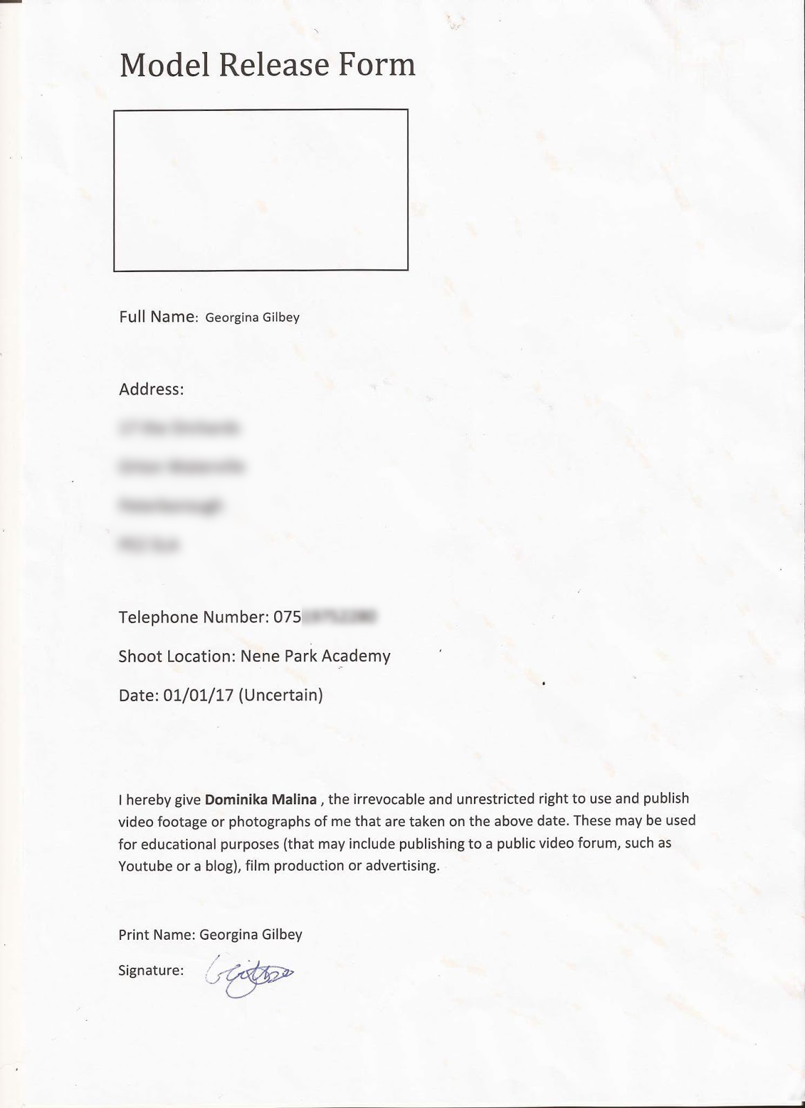
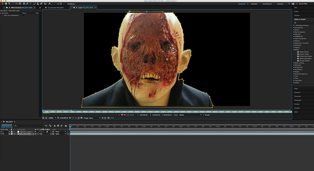
Before I produced video footage, I've edited some photographs that I wanted to use for the trailer as special effects. This large image on the left side was going to be used as a split second scene inspired by another psychological trailer called "The Silence of The Lambs" that used the same effect. I made the image look scary by enhancing some colours in Photoshop using the filter gallery and "Vibrance & Saturation" in the Adjustment settings, but before that I've made the original photograph of more visually appealing by enhancing "Brightness and Contrast".After that step, I've made two versions of the same image, both including the colour red because this colour connotes to blood, death and passion, a bold colour with strong meaning. The image that has a red face, I've made it even more 'demonic' by filling in the eyes using black; another dangerous looking colour. I've used these two images in my trailer during the kitchen and the knife scene to add more suspence.

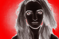
The second step was to edit other photographs I wanted to use for the trailer, in this case the 'stop motion' shot. I've took continous photographs while the actor was shouting inspired from a YouTube music video called "My OCD". After taking the photographs, I've processed them on 'Photomatix' using the HDR options in order to bring out the white dress and darken the backround.


After I got my first footage to work on, with limited resources - I've implemented chosen videos to work on while I wait for another film shoot. I've edited some footage on Adobe InDesign by adding filters, choosing the presets or moving the colour sliders. In this particular example, I am encoding the video footage of the forest scene I ended up not using because I believe that it didn't quite flow with the rest of the trailer.
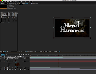
While waiting for additional footage, I've decided to work on the title and text. There was quite a lot of process and time put into the effects as I wanted it to look professional and fit my theme simultaniously. I've re-used the font I made for my magazine as it's original and links back to my trailer. I had an idea to use a fast forward video of clouds in my trailer, but later decided to combine it with the text making it look scarier. In order to save more time, I've used a pre exsisting footage of night clouds (from YouTube), set it on 'Multiply' (overlay mode) and placed it under the text layer (which was saved as a PNG as I needed the background to be transparrent).
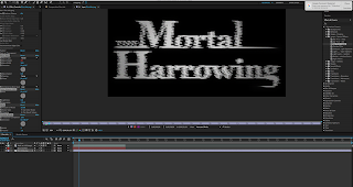
Then, I added an additional effect in the presets (using a programme called "Adobe After Effects") which was an old television effect fitting with the overall aesthetic of the trailer. I've used the same process with the text "This Autumn" but used a different cloud video and a different TV effect in the Presets. I placed both texts near the end of the trailer.


I also added a 'Cartoon' Filter over the background video to give it an interesting style and added another colour changing effect making the shot a lot more eye catching and easy to remember.


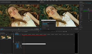
Some shots that I've filmed needed to be more smooth, such as the shot of the protagonist laying on the grass. The camera was handheld therefore there was a lot of camera shake. To fix that problem I used a Stabilizer option in in Adobe Premiere Pro. In order to add an additional (a more pessimistic and mysterious) mood, I've edited the colours of this particular shot in the programme. I've made the colours a lot 'colder' giving the audience an uneasy mood.


Additionally, I tried to follow my story board as closely as possibly. For this shot, the idea was exactly the same but I've decided to keep her eyes open and changed the composition by placing the camera closer to her as it makes her appear more personal with the audience by exchanging eye contact. Not to mention, since it was autumn (fitting well with my genre and theme) I've decided that my cast member should lay on the ground surrounded by dead leaves instead of blooming flowers. I've achieved the 'zoom out' effect without using any additional equipment.


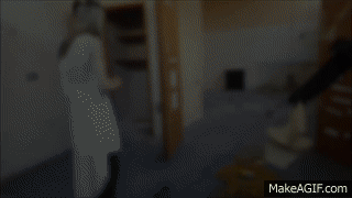
While working on my video, I wanted my last scene to appear more terrifying but the background was too light. Therefore I tried masking out the background on a programme called Adobe InDesign by outlining the monster with a lasso tool, inverting the selection and darkening it. However, this idea did not work because there was too much movement from the monster and I didn't want a still image as my last scene, therefore I blurred the selection meaning that there were't harsh edges successfully making the background darker and keeping the movement. Finally, I adjusted the colours for this scene making the reds stand out and increasing the contrast.

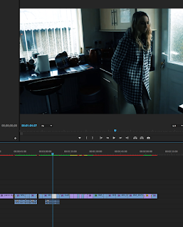
After editing almost ever shot separately, I've combined them in Adobe Premiere Pro as seen on the left hand side. Most sound was removed because I wanted the trailer to be mostly narration and music. However there is some dialogue to give some ideas to the audience.

Before the trailer started, I implemented Warner Brothers and New Line Cinema by downloading the company introductions clearly showing the audience that the trailer is associated with these companies.


Sound

The bass was produced with Polivoks VST. That was send through a compression channel to compress low, middle and high frequencies eventually producing the "White Noise". In parallel, there  was the same Polivoks bass line that went through EQ and compression. Low frequencies were high passed to let 'Sine Waves' travel their distance without any interruption whatsoever. Additional sound was recorded in real life using instruments. Then, I've added effects to that recorded sound and sat through hours of sessions. All of that recorded sound was used.

The process of the soundtrack will be shown in this video;


Friday 10 February 2017

Shooting Day 3: VLOG

Since the two locations were un-available, I've obtained permission from the old school building. The building was just what I wanted for my trailer concluding that the shoot was successful. This was the final and most important shoot for my trailer. The building had a prop which was useful, it was a rusty knife and the location was easy to get to meaning that I did not need any transport costing me no money. Fortunately, this was a great opportunity to re-shoot the monster mask as my first shoot was unsuccessful with focusing. Overall, the video shows every detail of the process including technical difficulties with the camera and 'bloopers'. 


Shooting Day 2: VLOG


School Hall: 

This was an important shoot for the beginning of the trailer, with careful planning of the sound track, I obtained the notes by printing them out and tried to match them with the piano in order for it to look realistic. for half an hour, we studied the notes for the shoot on the piano. I also used this opportunity to make another shoot for the dialogue. This video shows the details of the filmmaking. 

Thursday 9 February 2017

Magazine


This is my final magazine for the upcoming trailer.


Magazine front cover from DomMalina

This PowerPoint Presentation explains the Photoshop process of this magazine thoroughly.

Thursday 5 January 2017

Poster

Final Product


Photoshop Process

Process from DomMalina


Previous Versions:

 Originally, I wanted this image as my poster, closely following my sketch idea. Once I have finished with it, I've decided to redo it because it didn't seem to fit with the story, people assumed that it was more about drama rather than psychological thriller/ horror related. Therefore, I've kept the main image in the center and changed the surrounding faces to different photographs I used for a short trailer shot.
Right before finishing the poster, the tag line was in red because the colour red relates to danger, blood and passion which is quite fitting for the sentence. I've changed my mind at the last second and changed the font colour from red to blue to match completely with the whole poser making it look more professional overall as it fit's with the overall theme.

Tuesday 3 January 2017

Shooting day 1: VLOG

We decided to organize a car ride to the destination RAF North Witham for my Psychological Thriller "The Mortal Harrowing". Originally, we planned to go to RAF Upwood, but we decided last minute that we might have a better chance of getting in without permission issues at North Witham. I intended to film half of my trailer in this destination (abandoned building) but it didn't go as planned as we ran into various challenges of film-making and property issues.


Animatic

This is my idea for the trailer in animation, it features no sound because the complete product will be likely longer than this animatic. I have used Photoshop CS6 and a Wacom tablet to draw these sketches and moving the object/ figures using layers. The girl with black hair is the protagonist, however, in the completed piece, the actress will have lighter hair as I only made it black to make this character recognisable in the cartoon. As seen in the video, the main character mostly wears a dress, she will most likely wear warmer clothes during the actual shooting. 


As seen in the video, (the thumbnail image of the video) I was inspired by the scene below which was in an "Antichrist" trailer. There are other scenes within my story board that were taken from other sources such as the talk with a therapist scene inspired by "Mr. Robot" and the stop motion head twitching effect was inspired by a musical YouTube video called "My OCD" by Rhett & Link.

Flat Planning

Magazine

This is the plan for my magazine cover. It has well known magazine conventions, like the masthead, skyline, puffs and taglines. I have stuck to my original idea, with the model standing on her side and looking mysterious.  The Masthead will have a bold and big font, being the largest text in the magazine with the rest of the text being a lot slimmer in style. The background will be black in contrast of text which will be light in colour, therefore I will photograph the model with a dark background.  The bottom section of the magazine will most likely have photographs of ;other movies' to attract more audience.

Poster
This is the plan for my movie poster. It features the main character in different perspectives achieved by flash exposure photography. I want the theme to be quite mysterious here, to create lots of intriguing enigmas which is the reason the background will be dark blue or black. I've decided to make the text mostly white, blue and red so it stands out in contrast and matches with my chosen genre. This type of poster is a portrait, which is quite popular in the film industry. 


Story Board