So, what are the differences between trailers captured in the past and modern trailers? Film production logos are similar to any other logo's for any other product such as a drinking beverage called ''Pepsi", the design has been changing and rebranding ever since the product came into the market. The logos always stick to their original design in order to to be recognisable from old films they have made. An original 'old fashioned' film production logo is "Metro Goldwyn Mayer" which features a quick clip of a lion roaring. "Metro Goldwyn Mayer" is an extremely recognisable (especially in older films). Even this type of logo is renewed every time the quality of technology increases drastically. Additionally, modern logos are simplified in today's society because simple logo's are more recognisable and are easier to remember. An example of a simplified film logo could be "Paramount" a recognisable logo of a mountain surrounded by stars. Although, this logo varies depending on where it is shown, such as a film. "Paramount" looks a lot more realistic and detailed when it is shown in a film or a trailer but on a product or typically a website or on social media the logo looks quite simple and coloured in a single colour. These type of simple logos are quite useful for websites as it creates a clean and well polished professional look.

Film titles can vary a lot depending on when the film was made and what genre it is (romance, comedy or horror). For example, movies that are in the romance genres are likely to use words such as: 'Love', 'Us', or 'Together' for film titles that are far less likely to be used by Horror films as it doesn't relate to the story. Moreover, "Psycho (1960)" is an original title for a movie revolving around a man who is a psychopath and has no empathy. However, there is also a modern film based off the original 1960's film's context as well as the title which is "American Psycho (2000)". The reason why its title isn't exactly the same is because it would create confusion and could actually decrease the sales of the film because a successful film with the title "Psycho" already exists.
British Board of Film Classification
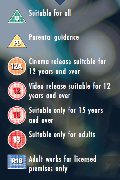
BBFC Certification is used to put age restrictions on films to prevent certain type of 'audience' from watching violent or immature content. It is also useful to get target audience and it's a useful guide for customers to know what type of film they will be watching. The top symbol on the image is for Universal audiences meaning that it is suitable for all audiences aged 4 years or older. Films with this tag are likely not going to have discriminatory language, drugs or violence. It can feature nudity but without any sexual context. The next symbol below is ''PG'' meaning ''Parental Guidance", this suggests that the films might not be sensitive enough for certain type of children and children under 8 are advised not to watch the film. 12A and 12 are generally not suitable for children under 12 years of age unless accompanied by an adult. These films typically have moderate language, violence or threat. The next one down the list is a symbol with number 15 on it, this suggests that no one younger than 15 is permitted to see the film because very strong language is permitted and other factors such as drug use (without promotion) and strong violence. Last but not least, a symbol with number 18 on it which means that only adults are allowed to watch the film, however, even these types of films have restrictions such as explicit content that might harm the public heath or morals. The final symbol is R18 which is a special and legally-restricted qualification which primarily focuses on controversial, violent and extremely sexual topics. These types of rules have formed in 1912 by members of the film industry and the acceptable amounts of strong languages, violence and drug use in a film varied between ratings ever since. Something that was acceptable 40 years ago might not be acceptable today.
Example #1: The Third Man (1949)

 These two on-screen texts above are shown in the trailer in-between some sequences of action and dialogue. The first one states "THE DEEPER HE GOES" followed by "THE DEADLIER IT BECOMES" text like this are typically used for trailers that do not have narration and in order to maintain the suspense the dialogue and action creates between and during the time when the on-screen text appears, the text prevents the suspense from interrupting. This text is used to raise questions for the main character, for example, 'what or who is making his journey deadlier?', 'is he going to resolve the mystery without dying?'. Finally, the title of the film is featured right before the trailer is finished followed by credits. The film title is also animated to make the trailer look more proffesional and it could also be a branded image of the name which is a light house. After the animated title, a lot of on-screen text appears, the text is for naming the creators and the cast of the movie.
This trailer is a great example of a classic film. The Third Man is a part of a thriller and drama and the trailer clearly states that as it starts off scary because the character is in a dark environment such as a sewer. The cast are also quite serious but the trailer has an unexpected turn, it starts to feel comedic because they feature characters smiling and running through the streets with a cheerful soundtrack and edited text. This suggests that the film has a comedic sense to it as well. The context of the film is mostly about investigation and curiosity because the main character is investigating the mysterious death of his old friend meaning that this film could also attract audience who are into the mystery genre. The movie is PG rated by BBFC meaning that it is quite friendly in terms of explicit content, the film can be watched by children that are accompanied by an adult. The trailer begins with text that says "Rialto Pictures" and right after the text disappears, a large shadow of a man appears in the scene. Its an effective way to cause the viewers to ask questions such as "who is it?" and "why is he there?" which will increase the suspense and cause them to watch the whole film. The trailer has no narrator but it does feature some dialogue of main characters even though most of the action is portrayed through movement, emotion, text and music. The trailer likes to show short cuts of environments in the film, the first one is a dark street, the next cut is text followed by a short cut of sewers and the third cut features another text that says "discover" followed by a shot of an abandoned theme park from a low perspective. This type of film could appear cliché to modern audience because there were a lot of films made with a similar story since 1949. The trailer seems quite short as well as it lasts for 1 minute and 30 seconds whereas an average 'approved' trailer could last up to 2 minutes and 30 seconds.
Example #2: The Ghost Writer (2010)
:
This trailer is thriller/mystery and is modern as it was made in 2010. This film, on the other hand is rated PG-13 meaning that it is made specifically for more mature audience as it is more likely to feature 'harsher' content such as language, violence and drugs. However, the reason why it's PG-13 is because they needed a wider range of audience. Originally, "The Ghost Writer" was an R rated film but they cut out and trimmed harsh language, blood scenes and more. Compared to "The Third Man (1949)" the plot of this film is more complicated and less cliché because it's newer. New films need to come up with original content that will surprise the audience and capture their attention. Even though these two films have similar genres, the plot is quite different. The main character is called "The Ghost". Hiding the real name of the main character makes his personality traits to seem suspicious and mysterious which could lead up to a quite good plot twist. The films also has no narrators but it starts off with a dialogue of two people accompanied by text in order to explain the plot and show the relationships between the characters. The trailer also features a lot of places such as the airport and sea suggesting that the main character is switching between environments in order to achieve his 'goal'. during the end of the trailer, it becomes fast paced meaning it shows off more action in shorted cuts in order to create a sense of 'thrill' to the audience. 

No comments:
Post a Comment